The notion of a 'green transport hierarchy' to help guide individual decisions as well as the planning decisions of public bodies has been around since at least the 1990s.
Traditionally, they would start with the best environmental option (walking) and end up with the worst (private cars). Public health bodies were also keen on this approach for obvious reasons.
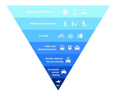
Since the Covid19 pandemic, and some of the lessons learned during that period, it is now possible to see the hierarchy reimagined for the 2020s, such as the one below from the UK's Energy Saving Trust.
It is intriguing to consider that I am in some way 'travelling' when I am joining a Zoom video conference in Zaragosa – because it doesn't feel that way – but it is a useful additional idea to add into the conversation. (The impact of video communications can be found in our guide to video conferencing platforms.) Flying has also been included in this version because it is designed more as a guide for individuals rather than town planners.
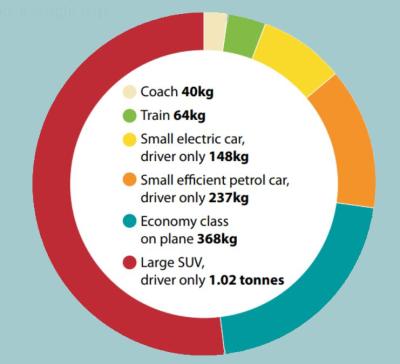
Transport hierarchies provided a useful introduction to the notion of relative impacts of different modes of transport, but are, nowadays, being replaced by attempts to provide more sophisticated data on the wide variety of choices within each layer. For example, the next table down compares mode of transport and CO2e per mile: for the cycling figures it includes calories burned by the human pedalling, and so a transport hierarchy diagram would presumably list walking below cycling, since cycling is more energy efficient per mile.


